

“This newsletter consistently brings me so many insights on how to show up on Instagram and sell my digital products .” - Paid reader.
If you need to get in touch with me, email erica@jagoyoga.com And if you're interested in joining a live masterclass on personal branding come end of July, reply and let me know — I'll send you the link.

Sara came to me with a lovely website.
Three offerings. Three images. All competing at the same volume. Your eye did not know where to go first. So it went nowhere.
I am a graphic designer. I have spent 25 years making work look as serious as it deserves to be.
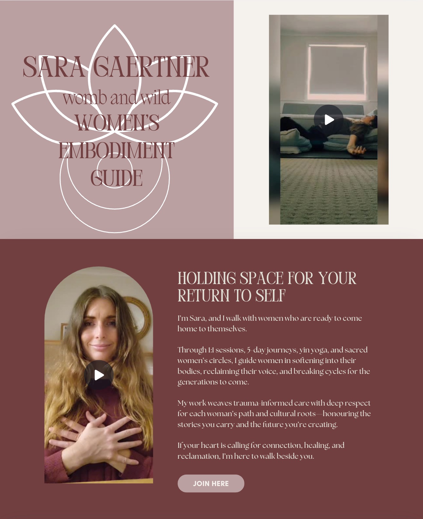
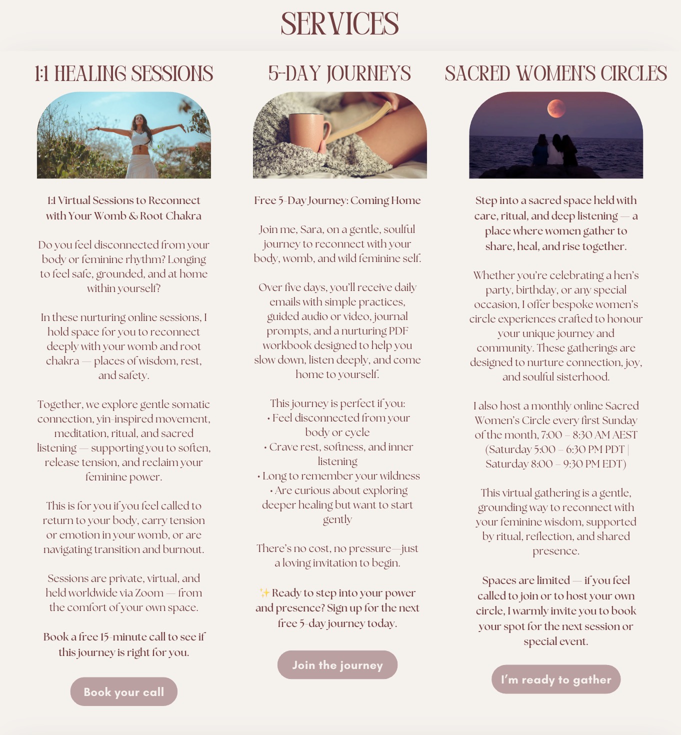
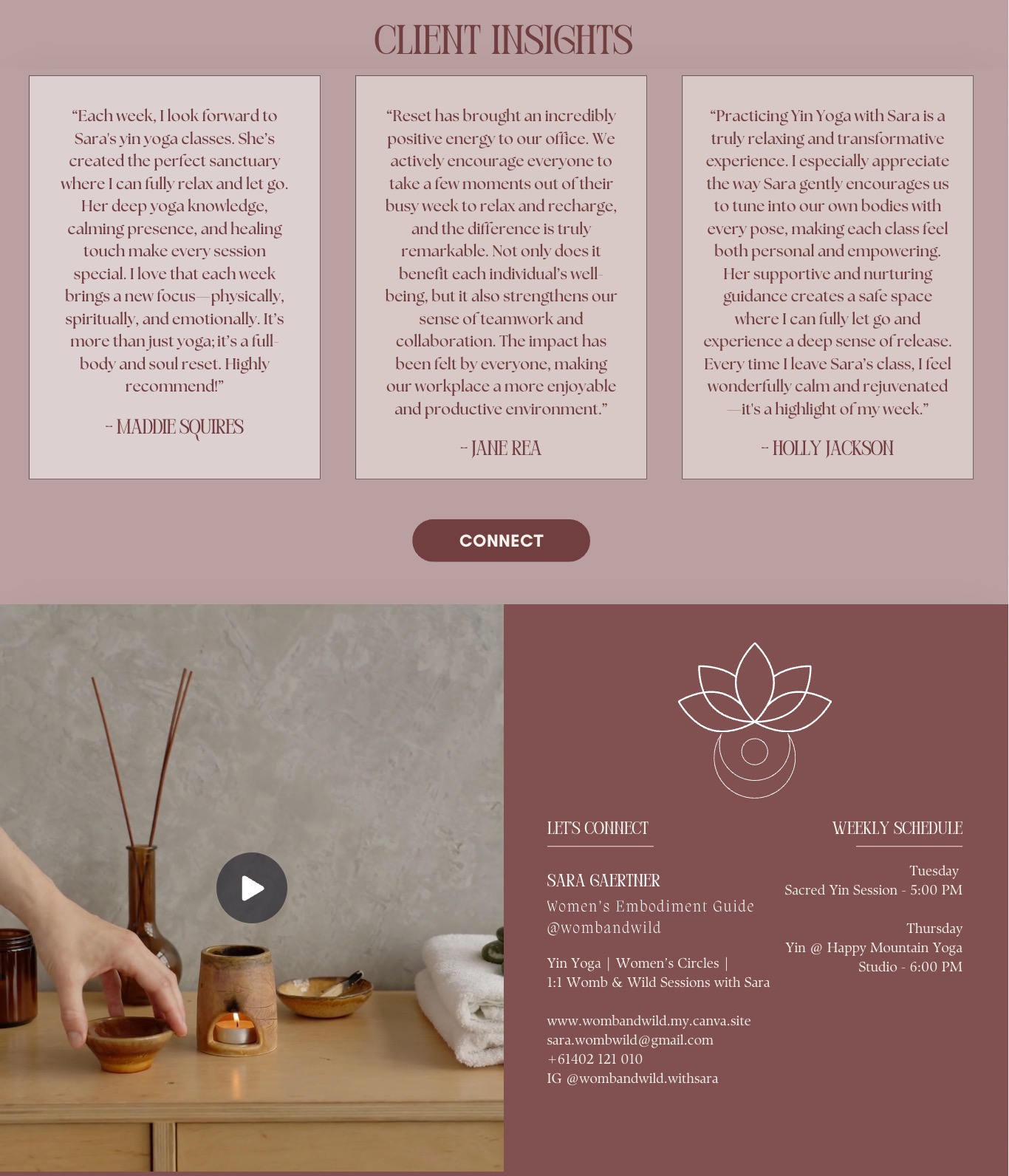
Here is what I know about pages like this.
When everything has equal visual weight—the healing sessions next to the journeys next to the circles. The images the same size. The text the same importance—nothing matters. Nothing lands.
And I know this is not an easy message to hear.
When your page feels cluttered, the woman landing on it is already thinking one thing: Is this what a session with you is going to feel like?
Is she going to come to me overwhelmed and leave with more to hold?
That is not your fault. That is the page's fault.
So we rebuilt Sara's page.
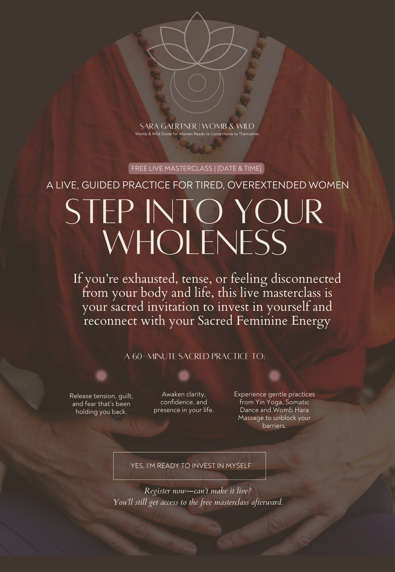
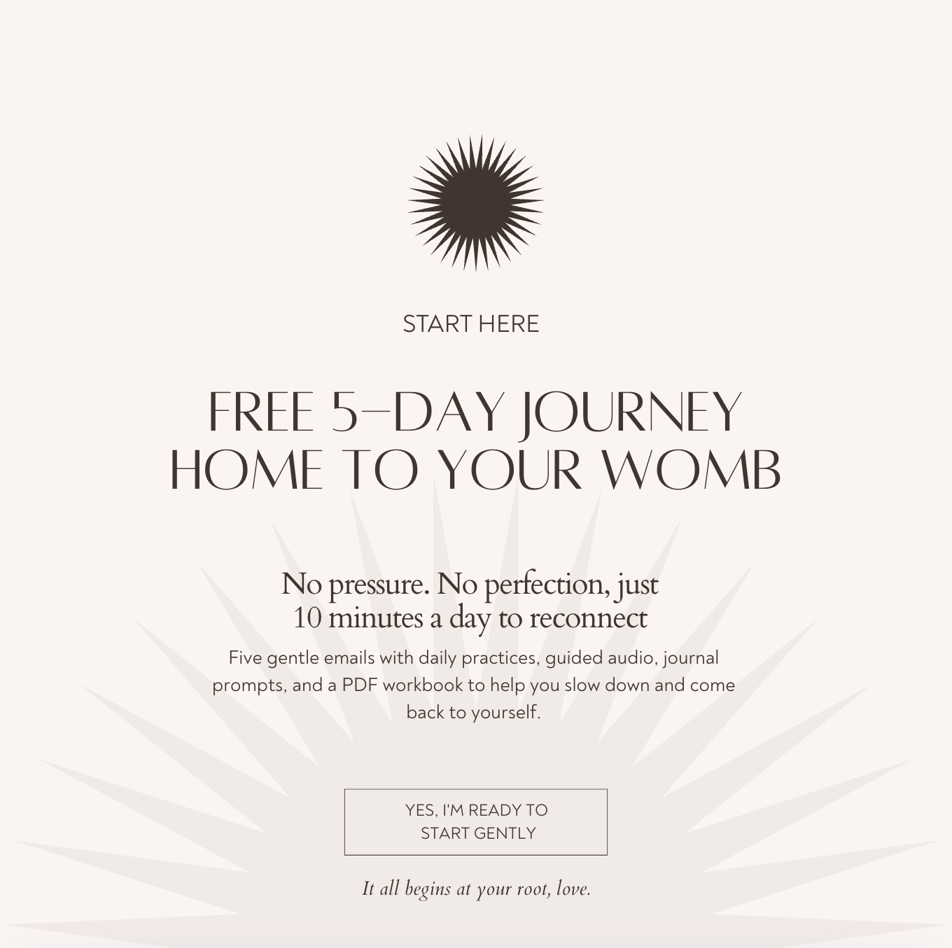
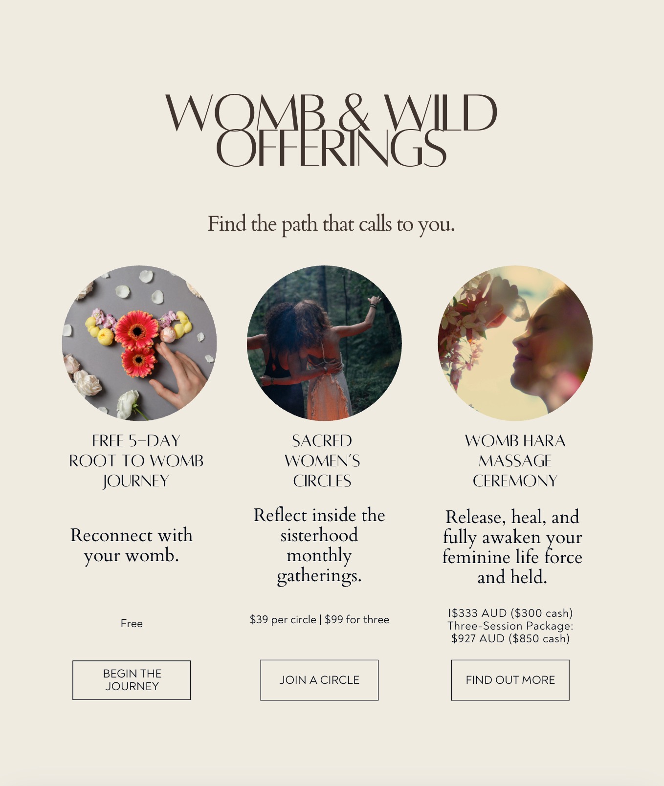
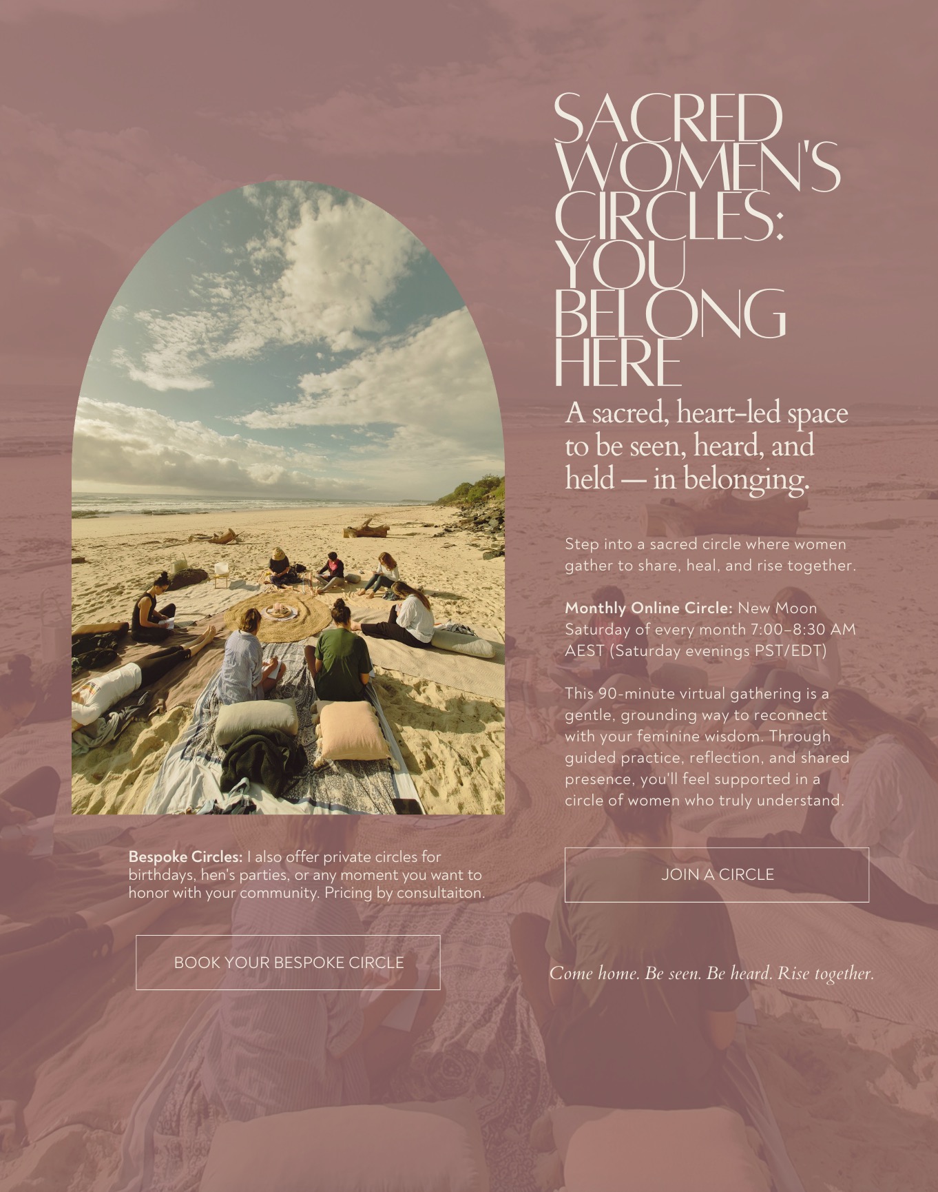
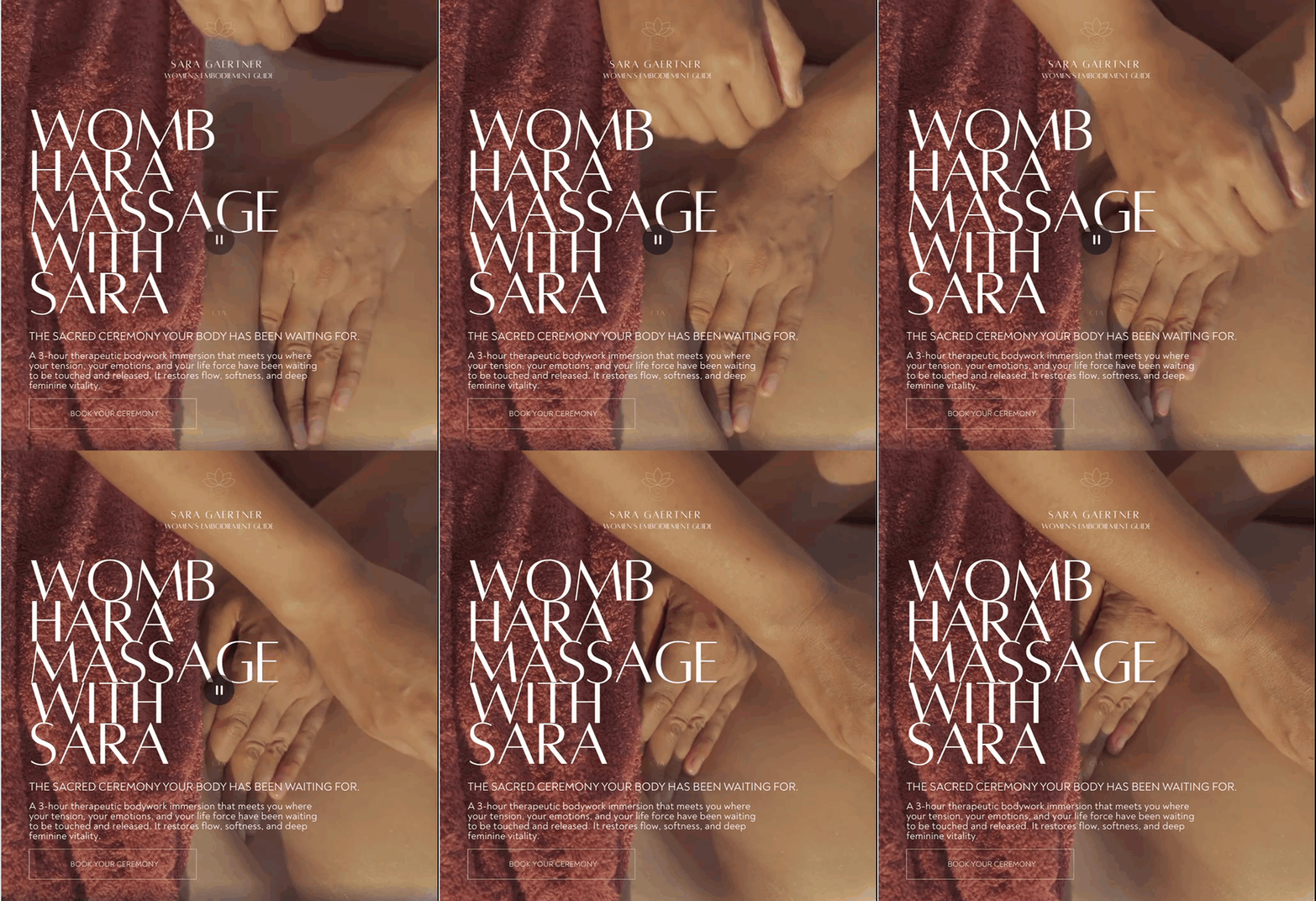
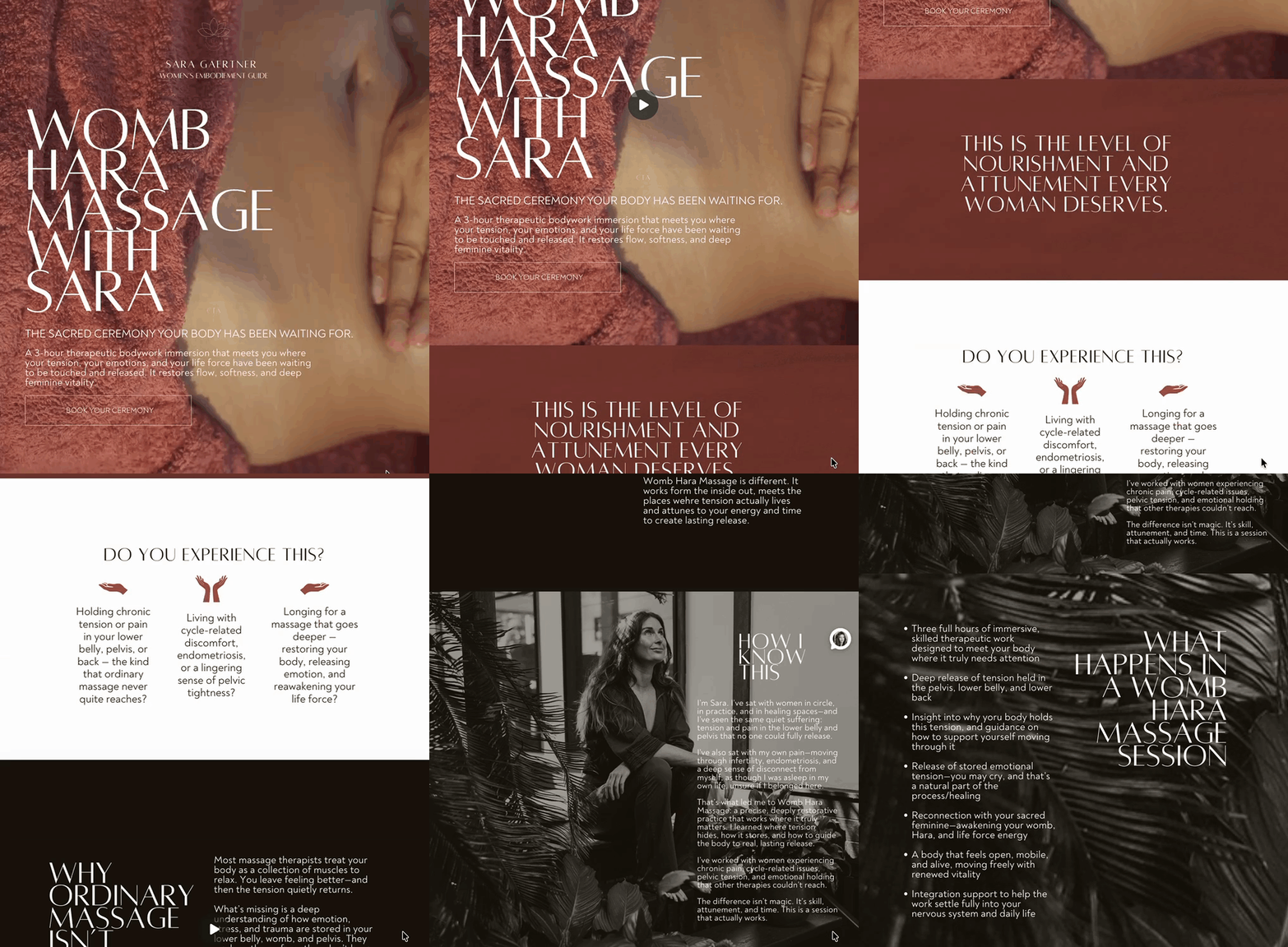
We blew up her image.
We created real hierarchy.
One offering at a time to take in.
One breath at a time to digest.
We made her call-to-actions clear.
Book your call.
Join the journey.
Reserve your spot. Simple.
Matched to her energy exactly.
NOW the page started to feel like Sara, whom I've come to love and appreciate for her gentle energy.
The women landing on it started to think—if booking a session is this clear and this calm and this easy, then that is what it is going to feel like inside.
The brand is the preview of the experience.
I'm not so much into rebranding or reinventing the wheel, and as you can see, we just left her lotus flower logo alone. We didn't even go out and do a whole new photoshoot!
We just got her page to start telling the truth about the woman behind it.
That woman is already incredible. The page just needs to catch up.
What is your page communicating right now? Is it telling people they are going to feel held or overwhelmed before they ever book?
This Sunday
I’ll walk you through the exact page audit I used for Sara’s redesign—how to spot “cluttered page” clues, and how a few simple hierarchy shifts can turn overwhelm into clarity.

50% Complete
Two Step
Lorem ipsum dolor sit amet, consectetur adipiscing elit, sed do eiusmod tempor incididunt ut labore et dolore magna aliqua.