
Before you edit another reel, make a style guide. Why my branding still feels fresh years later, and how to build yours in one sitting.
If you need to get in touch with me, email erica@jagoyoga.com.

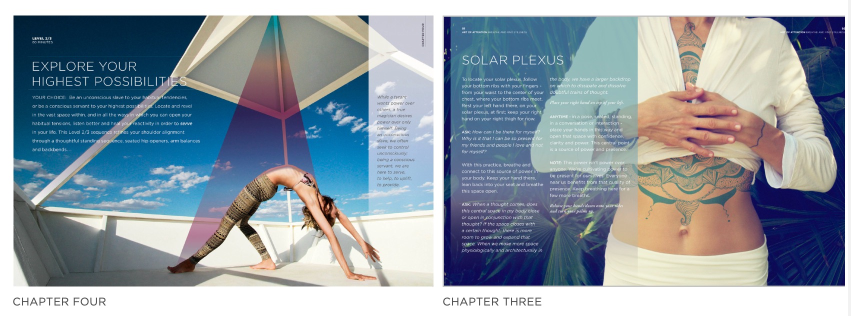
My branding hasn't really changed since 2013.
That was the year Art of Attention came out. We hired a design firm in New York City to look at the book. At the time, my color palette was the full rainbow (yes, I was chakra-obsessed). They QUICKLY swapped it for softer pastels.
That was the year I learned to choose color on purpose.
I still open those files and they look fresh to me.
Keeping one look for 13 years does take discipline. But the hardest part for MOST is making the decision once and writing it down. That page is called a style guide. It's the first thing I open before I design anything. A reel. A card deck. A sales page. A book for Oprah.
This week I posted a reel that said:
Before you edit another reel, make a style guide. If you commented INSIDE, this is the newsletter I promised you.
A style guide is the capsule wardrobe for your business.
A few pieces that all go together. Once they're chosen, getting dressed is the fun part.
I would sooooo much rather you spend eight hours testing and choosing your two final fonts than see 15 different fonts on your feed.
But picking them is not the only part. Knowing WHY you picked them, and how to use them every week, is what makes people recognize your post before they read your name.
THIS SUNDAY
The five parts of a style guide you'll actually use, and the one font rule I give every Resident. The two settings that make a free Canva font look custom. And a simple test that tells you if your style guide is ready to hand to Claude.
Build your style guide in one sitting
Put all five parts on one page. Next to each choice, write one sentence about why you chose it. If you can't say why, you'll swap it the next time you see something prettier.
1. Two fonts
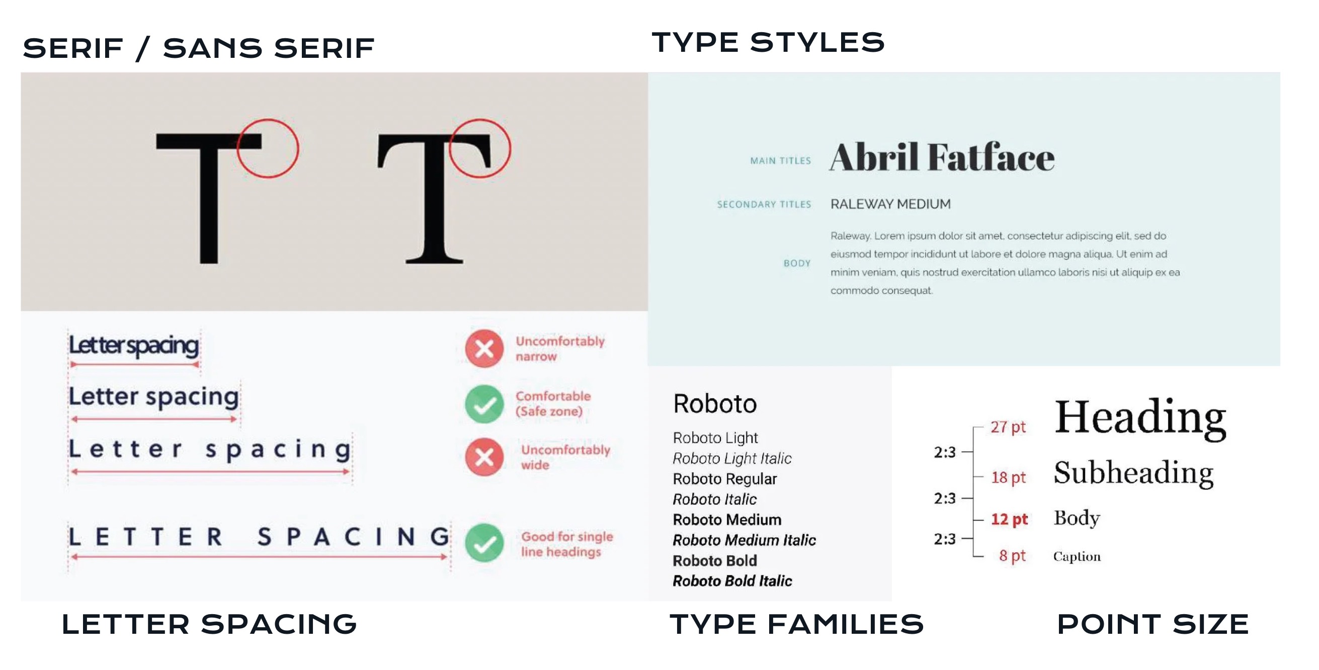
One serif and one sans serif. One for headlines, one for everything else. Any more and the page starts arguing with itself.
Your why: what should the headline font make someone feel? Calm? Bold? Old soul?
Free fonts are fine. I use them. A free font only looks generic when you leave it on the default settings. The two settings that matter most are letter spacing and leading (the space between lines). I tighten the letter spacing on my headlines every time.
Write your settings down. That's your recipe. Repeating it is what makes free ingredients look custom. I call myself the dentist of design because I see these tiny things. Your followers won't name them, but they'll feel them.
2. A color palette
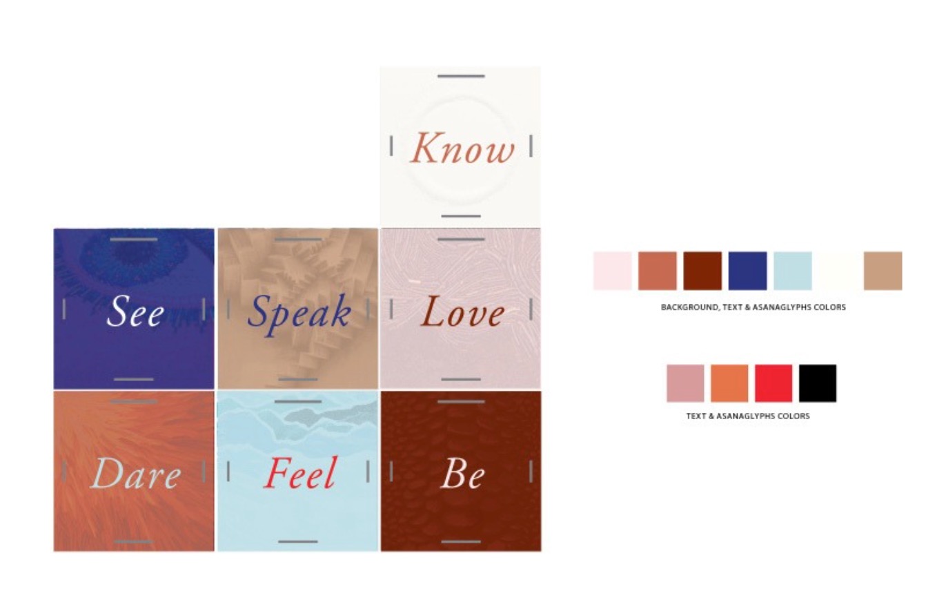
Three to five colors. One main color, one or two that support it, and one neutral. Write down the hex codes so you never guess again.
Your why: what does your main color say about your work? A color you just like is a color you'll get bored of.
When the design firm swapped my rainbow for pastels, the why was simple. My work is calm. The colors had to say that too.
(My ketchup and mustard theory is coming in a future Sunday. Once you hear it, you'll never unsee it.)
3. A graphic style.
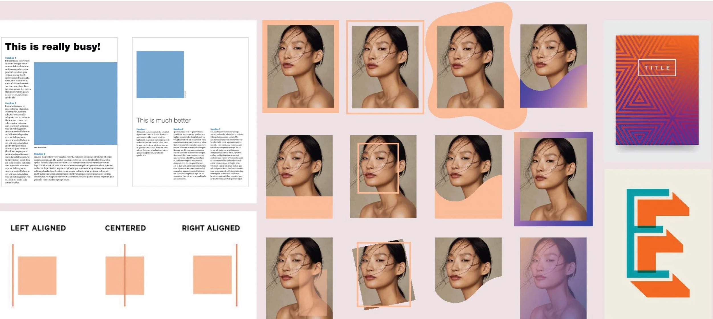
Photos or illustration? Clean or textured? Light or moody? Pick a lane.
Your why: how should your posts feel next to someone else's in the feed?
4. Your rules.
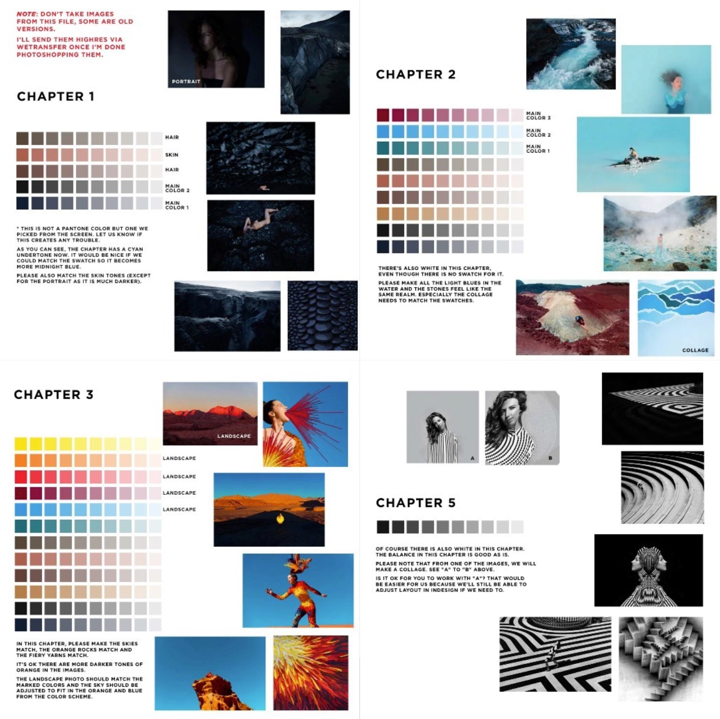
This is the part most style guides skip. Write down how you use it. Which font goes on your reel covers. Which color is only for your offers. How much text sits on a slide. Three to five rules is plenty.
5. One home
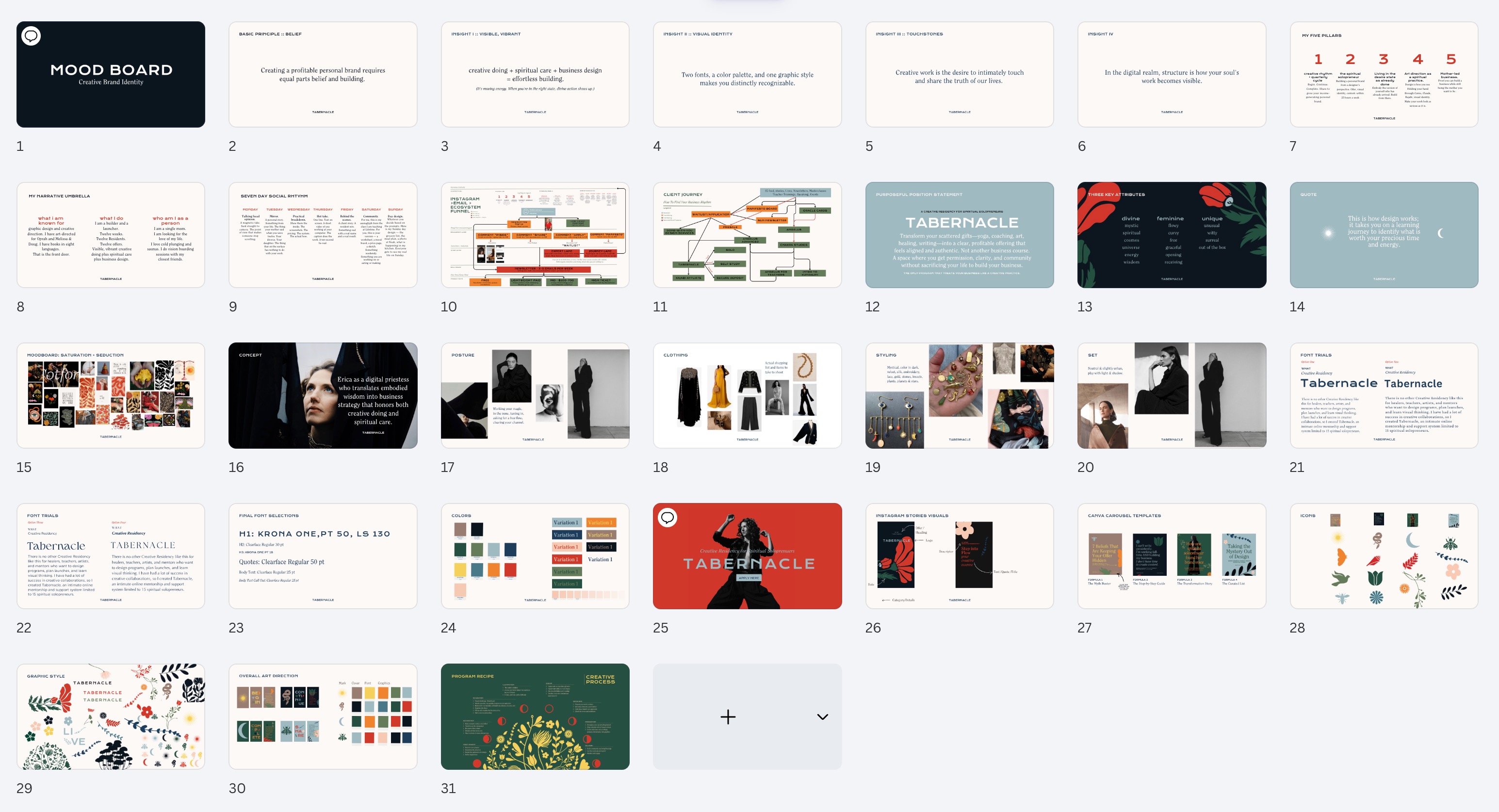
A single page in Canva or Notion where all of it lives. You open it first, every time.
Here's where it pays you back
Editing reels gets faster. Open Edits or Canva and your fonts are already chosen. You only tweak a little depending on the hook.
Making a product gets easier. One of you asked how I make my books and card decks. Every single page I design starts with a style guide.
Working with Claude gets clearer. So many of you are tired of training it, saying the same thing over and over. Give it one style guide with your whys and your rules, and most of that training disappears.
The test
Could you hand your style guide to someone else and get back a post that looks like yours? A friend. An assistant. Claude.
If yes, you're done. If not, the missing piece is almost always a why or a rule.
Inside Tabernacle, this is the part we do together, inside your actual files, until it holds.
Your homework
Open a blank page. Write down the two fonts you use most. Write down the three colors you keep reaching for. Look at your last nine posts and name the graphic style you see. Then add one why to each.
That's your first draft. Most of you already have a style guide. It's just scattered across 40 different files.

What I'm working on:
A masterclass on exactly this: choosing your fonts, your colors and a style that is yours, without paying a designer $10,000. Tell me your three biggest struggles and I'll build it around them.
CLICK HERE It takes 35 seconds.
Your words made my week :
✿
Every artist I love has a few rules they never break. Deciding once is what gives you room to play for years.
Until next Sunday,
Erica
SAVE THE DATES

Responses