
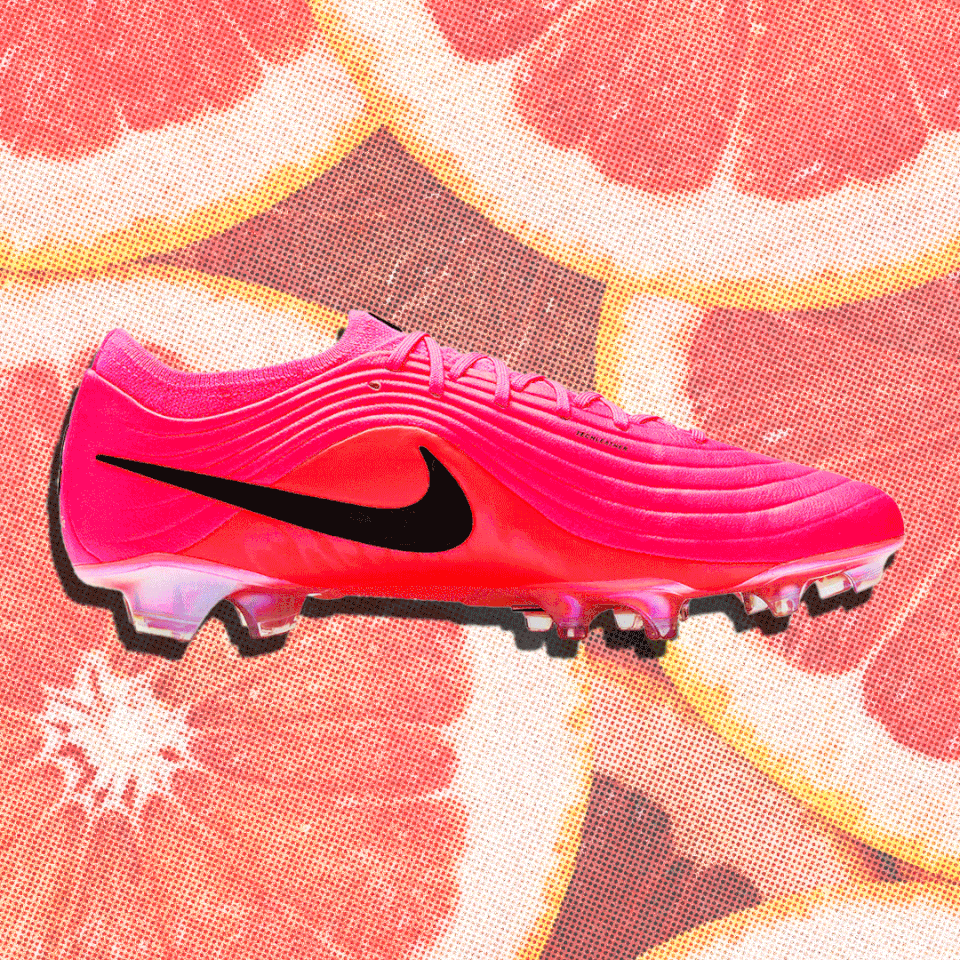
Did you notice the pink at the World Cup? There is an invisible empire behind that color. And once you see it, you cannot unsee it — or your own brand decisions.
New here? This issue is free. All of it. And if you want the live masterclass on this coming July, reply and let me know — I'll send you the link.

Did you notice the pink at the World Cup?
Everywhere. Every single cleat. Every single brand. Most people scrolled past it without thinking.
I am a creative director. I cannot scroll past it without thinking.
Rooms full of designers debated that color. Trend forecasters predicted it years ago. It filtered down through collections, manufacturers, retailers, until every player wore the same shade.
That is the Devil Wears Prada moment. Andy thinks her blue sweater is just a sweater. Miranda explains: that blue is cerulean, chosen by designers years ago, filtered through eight collections until it landed on her. Andy thought she picked it. Rooms full of people picked it for her.
That is what is happening on that field.
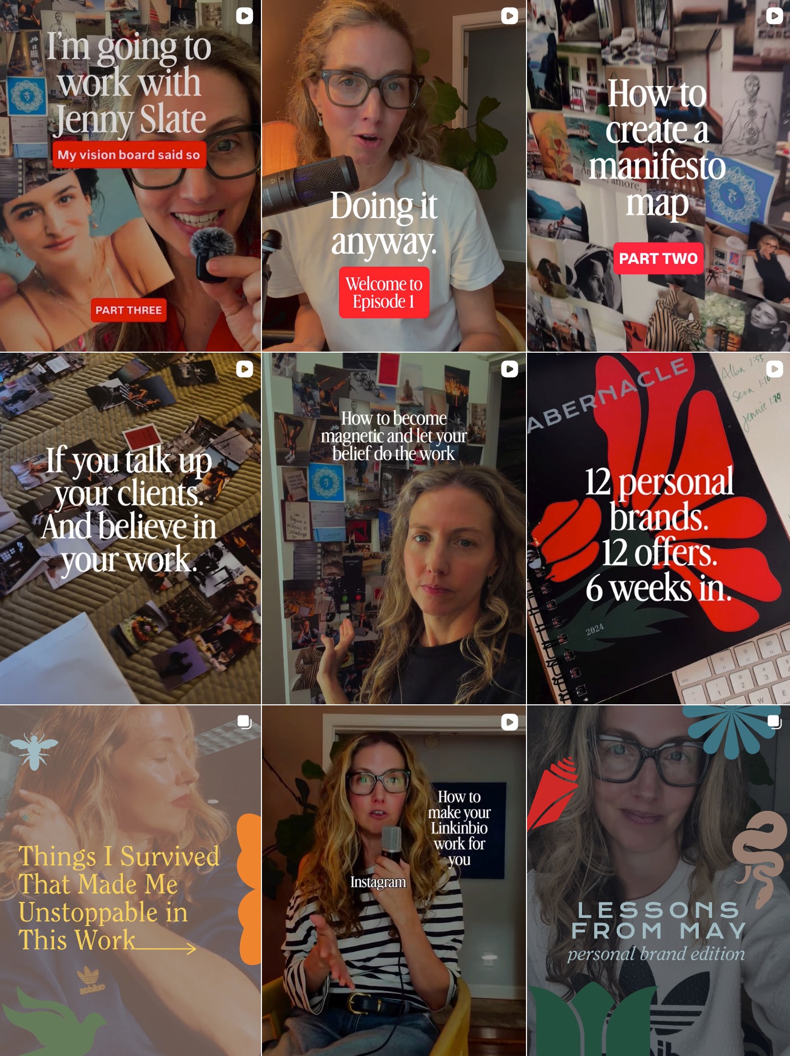
Your personal brand is making decisions with or without you. Your fonts are saying something. Your colors are saying something. Your graphic style is saying something. The question is whether you are the one who decided what they say — or whether it defaulted.
I teach three things when it comes to personal brand.
Your fonts. Your colors. Your graphic style.
That is the whole empire. When those three things are decided on purpose :: really decided, with intention, and then committed to completely :: you become unavoidable. Just like those cleats.
This Sunday
How to look at your own IG grid the way a creative director would. Three decisions. Three fill-ins. Plus: what 600 saves on the Manifest Map told me this week.
Let me start with fonts because they are the most misunderstood.
Most solopreneurs pick a font because they like it. Or because it looks clean. Or because they saw someone they admire using it and thought — that feels right.
That is exactly how Andy ended up in the cerulean sweater.
A font is not decorative. A font is a voice. Serif fonts say something different than sans-serifs. And when you change your font every three months :: which I see constantly :: you are telling your reader that you have not decided who you are yet.
Do this right now.
Open your IG grid. Look at your last 12 posts. Count how many different fonts are showing up across your graphics.
If the answer is more than two, you have not decided yet.

Here is how to decide:
Your headline font lives on your graphics, your cover slides, your story highlights. It communicates your entire aesthetic in one glance.
Serif = authority, editorial, grounded.
Sans-serif = modern, clean, minimal.
Script = warm, personal, handmade.
Your body font carries your words. It pairs with your headline. It does not compete. Then you use All caps vs Lowercase vs bold vs italics. you come up with a recipe and stick with it.
Here are three combinations that work on Instagram:
Montserrat (headlines) + Open Sans (body). Clean and trustworthy.
Playfair Display (headlines) + Lora (body). Editorial and grounded.
Poppins (headlines) + Quicksand (body). Warm and approachable.
Pick one that matches what you want to communicate, not what feels trendy right now.
PICK TWO. Write them here:
Headline font: _______________
Body font: _______________
Those are your fonts now. Do not change them until you have used them consistently for six months and have a specific reason.
Colors come with an empire of psychology behind them before you even open a brand document.
Pink communicates warmth, creativity, and a certain kind of confidence — which is why every World Cup brand landed there at the same time. They were not copying each other. They were reading the same signal.
Do this right now.
Screenshot your last 9 IG posts. Look at them together as one image.
Ask yourself one question: does this look like one person or three different people?
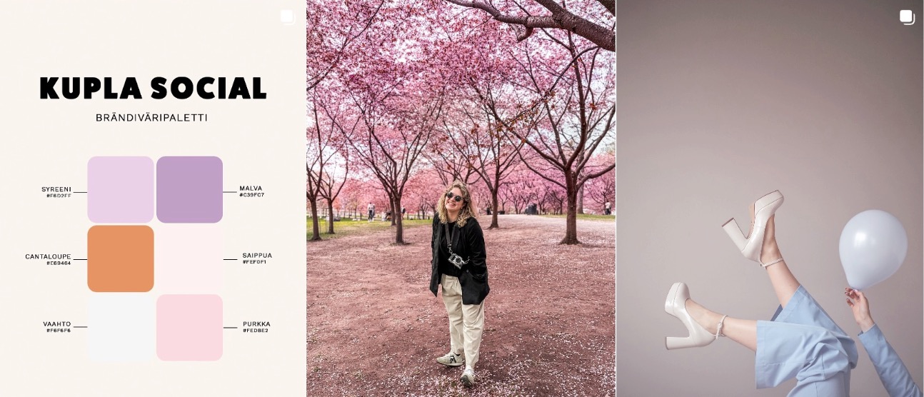
If it looks like one person: you have a palette. Name the specific colors. Write the hex codes if you have them. Use them everywhere, relentlessly, until people see that combination and think of you before they read your name.
If it looks like three different people: here is your assignment.
THREE TO FIVE COLORS. Pick them here:
Primary: _______________
Secondary: _______________
Accent: _______________
Neutral: _______________
Pick them because of what they communicate. Not because you like them right now.
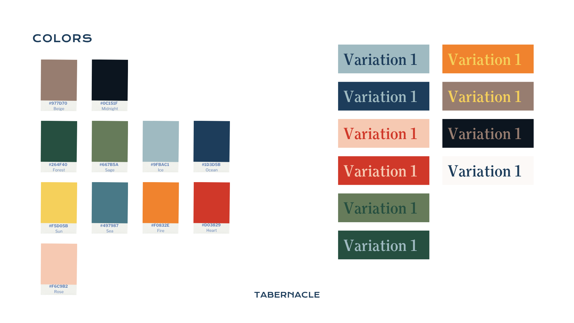
Once you choose these, they show up everywhere. Your story highlights. Your graphics. Your reels. Every single time. No exceptions.
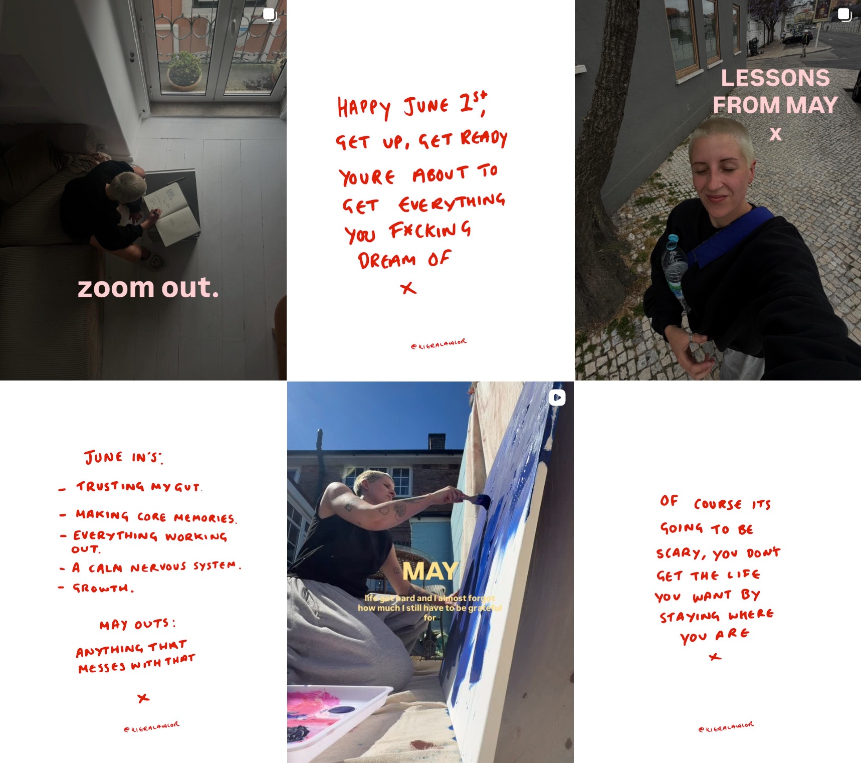
I love how simple her brand of fonts, colors, and graphic style is. The preset light pink color you can find on Instagram, the font Classic, then she writes in her journal, snaps the handwritten note, brings it into Canva on her phone, and adjusts the levels until all the background turns white, then changes the color to a duotone of red.
Graphic style is the hardest to define and the most powerful once it is set.
Do this right now.
Cover your name on your last three posts. Would someone who follows you know it was yours?
If yes: you have a graphic style. Name it in three words and build from there.
If no: here is how to find it.
Pick three accounts you love visually. Not to copy. To identify the pattern.
Write down what you see:
High contrast and editorial?
Soft and warm?
Bold and minimal?
Text-heavy or almost no text?


Every design decision on your IG goes through that filter now. Your reel covers, your story highlights, your graphic posts — same feeling, same person, every single time.
The brands that had decided were unavoidable at the World Cup. The brands that had defaulted were just there.
Your personal brand will be one or the other.
My coach told me, "You are not allowed to sit in worry. Only in belief."
I think that applies to brand decisions, too. Most solopreneurs pick a font while worrying it is wrong. They choose a color while wondering if it is professional enough. They build a graphic style while comparing it to someone else's.
Decide from belief. Pick the font that communicates exactly what you want to communicate and trust it completely. Choose the color that says what you mean and commit to it everywhere.
The World Cup brands did not hedge. They went all in on pink.
That is the whole lesson.
Ready to put this all in action?
Reply to this email if you want the July masterclass link.
I'll send it the moment we go live.
✿
Your followers won't experience you as a scattered stranger anymore. They'll get to know all of you and send you to someone they know.
Until next Sunday,
Erica
The door is always open.
Next Cohort begins September 2026. Get on the waitlist.

Responses